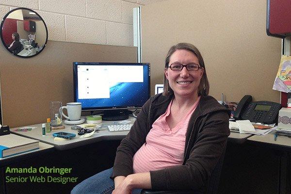
Amanda Obringer is our Senior Web Designer and has worked at Infront Webworks for over three years. Today we decided to ask her a few questions about the web design field and her approach to design in general.
1) How did you get your start in the design field?
I started in my multimedia class in high school, designing a program for the Mac called HyperStudio, which is one step above a program called HyperCard which a lot of people have heard of. It was my favorite thing to do during study hall—people would come to ask me for help and I’d show them how to use it.
It was nothing really in-depth; we were basically making fancy PowerPoint presentations. Later, when I went to college, I designed posters and brochures and things like that.
2) What was your first design-related job?
I actually got my start in TV. I worked in college at the local PBS TV Station, making graphics for television. They had a local news show that was run by the students at the school, so the journalism students could learn broadcast journalism, and the students in the telecommunications program could learn how to run the cameras and direct, and things like that.
Since I was in the graphics department, I would come in at 3:00 in the afternoon and they would tell us “We need twenty graphics ready to go by 5:00 pm.“
We would make banners and images that would pop up next to people’s faces with their names, or headlines like “Breaking News: Shooting Downtown,” and whatever I was tasked with doing would have to be done by 5:00 pm. So whether I had to make two graphics or twenty of them, I only had two hours to design them all.
I think that was excellent training for getting good at designing quickly and being able to make fast decisions and move on to the next thing. It was a really interesting experience; I also learned how to run cameras and set up teleprompters, and got a sense of how a TV show is put together
3) What made you want to major in design in College?
Originally, I was going to be a telecommunications major until I worked at the TV station where I decided that it was close to what I wanted to do, but wasn’t quite right. When I found the multimedia major, I decided to do that.
I was scared though, because I never thought of myself as an “artist” and never spent much time drawing, so I figured I wasn’t very artsy. But I ended up deciding that it was a change I had to make, and for whatever reason, it was the right choice!
4) What is your actual degree?
I have a degree in Visual Communications with an emphasis in Interactive Multimedia. Everything I took was digital: I took classes in TV production, audio editing, video editing, computer animation, graphic design, web design, infographics, and more.
For my major, I had to have specialization so I chose to specialize in History. I could have minored in it, but I didn’t really care about it so I never took the time to fill out the paperwork. Some of it was interesting though; I even took a class called History of Baseball.
5) Do you ever try to cross-train or work with a different medium like sketches or charcoal or paint?
Actually, I’m still really not an artist—I can do so much more with photoshop than any other medium so I’ve just tried to stick to that.
Sometimes when I’m designing logos, I sketch them on paper, and I’ll also draw out a wireframe for a website from time to time, but usually, I do it all on the computer.
6) Do you design things on the side, or for fun?
I try not to. I usually try to do other things like home improvement projects and things like that because if I start doing family Christmas cards, I’d have to photoshop them because I can’t just bear to print them off as they come from the camera.
The things I do on the side are learning how to write new code, or something like that because it’s always interesting to keep learning rather than just doing what I already know how to do.
7) Who is your favorite designer, regardless of industry?
Right now, my favorite designer is Jessica Hische. She’s a lettering designer. It’s amazing the things she can do; it’s very beautiful. And she’s really very interesting to listen to if you ever hear her speak.
8) What are your favorite websites and blogs about web design?
The three I read the most are A List Apart, Smashing Magazine, and .NET. Also, CSS-tricks (which is run by Chris Coyier, who is a genius). I don’t follow design trends that much, but I do try to keep up with what other people are doing.
If I come upon a new project I’m working on and find a way to do something I’ve learned recently, that’s great, but most of the time I don’t get out of my way to copy new trends in the industry.
Actually, I do so much front-end code that I’m really not just a designer… but I’m not really a developer, so I’m more of a “designer and front-end developer.”
9) What’s a new trick or feature you’ve recently learned or have used?
This isn’t really design-related so much, but SASS is awesome. It’s totally changed the way I write code. It’s so much easier to write and to make changes. Learning how to use CSS Preprocessors is the best thing I’ve added to my workflow in the past year.
10) You’ve done lots of kinds of design in the past. Web, Print, TV, Packaging, Album art, etc. How are these differences in the way you approach them?
For the most part, my approach is the same but there’s definitely a difference in those. People are always talking about how print designers can’t design for the web, and things like that, but I did so much packaging design that I’ve learned to just look at what’s going to work best in this format?
For example, when I made TV graphics, I was very careful not to use small fonts because people wouldn’t be able to read them when they’re sitting back on their couches. When I did album covers I had to figure out how the design of the side of the jacket would fit with the front cover, and how the disc would fit into the tray, and things like that. You’ve just got to think about how the end product will look.
I always wanted to do web though. I ended up doing print design almost by accident because that’s just what I was hired to do in my first job, so I did print for a while. And I really ended up liking it a lot more than I expected, but I always knew I wanted to get into web design, and I think I still like web design best.
11) What’s your favorite aspect of designing for the web?
I like doing code, and I like that it’s always changing. I’m constantly learning because it’s everything is constantly changing; nothing ever stays the same. I really consider print design as more of classic art, because while the technology in printing is changing slightly, it’s not like the web where everything’s always moving. I like it that way, otherwise, my job would become boring and my skills might become stagnant.
12) Does having a blank canvas intimidate you? How do you decide what to work on first?
It totally depends on the project. Sometimes I leave a creative meeting with the client and know exactly what I want to do and I’m so excited that I can hardly wait to start working on a blank canvas, and other times I just don’t know, and I’ll just stare at the canvas and not know where to start.
But what I’ve learned is that just because I know what I want to do doesn’t mean it’s going to happen quickly. Sometimes I start out knowing what I want to do, and then realize “this isn’t going to work out.” So actually, it’s more fun to start on a project where I don’t know what to do, and I play around and see what comes to mind.
13) You’ve been doing this for a long time—over 12 years! How have your design skills or process changed over the years?
Hopefully, I’ve gotten better! I’ve definitely become more confident, and I think I’ve improved overall. I’ve learned a lot about typography, recently. Although, I’ll never stop trying to get better. The thing I think I’ve improved on the most is being able to take a big, complicated collection of a lot of things, and simplifying it, and keeping a design clean.
In the future, I really want to learn more Javascript and get more time to do responsive designs for the mobile web. I’d also like to work more with clients in the beginning, during the planning stages, looking over the content they already have. A lot of clients haven’t really thought about their content very much, so for me to be able to help them plan their website from the beginning is a lot better than having them give me all the control for the design and then coming back weeks or months later, asking for changes now that they’re finally giving it a hard look.
14) What is a mistake in design that you commonly encounter?
A lot of companies try to have their websites designed for themselves, rather than thinking about the end-user. Who is their audience? What is going to resonate with them? These are questions clients don’t often ask.
They do ask for things that they probably heard somewhere say several years ago, such as: “make sure to keep everything above the fold,” and “keep everything within three clicks of the homepage,” but those are not nearly as important. What they should be doing is asking “what content is going on this website?” and “what is going to make people want to buy the products or sign up for more info?“
I like to ask the question “why?” after everything. When a client says “can you make it pop?” I ask “why?” When they say “make my logo bigger,” I ask “why?” I also ask questions like “are the people that will visit this site coming here because they already know who you are, or are they finding you from a Google search?” If so, we need to keep that in mind.
15) What is your favorite book on design? Also, do you have any favorite artists or pieces of art that inspire you?
Definitely “Design is a Job,” by Mike Monteiro. Who doesn’t love him?
I really like the big pointillism painting at the Art Institute of Chicago by Georges Seurat, called “A Sunday Afternoon on the Island of La Grande Jatte.” It’s GIGANTIC (10 feet by 7 feet) and it’s a great example of how up-close, looks blurry, but when you stand back it looks beautiful. Also, it’s the painting in the movie Ferris Beuller’s Day Off!

Allan Todd is CEO of Pagecafe Digital Marketing. In 2022, Allan teamed up with Infront Webworks to provide digital marketing, website design, content marketing, SEO and strategy and solutions to local businesses. Allan lives in Colorado Springs.


