Note: this is part two in a series called “Building Websites for Mobile.” The last post covered why it’s important to consider mobile users while this post discuss how to make your website mobile-friendly, and the next will cover what you should (and shouldn’t) put on it.
Hopefully, after reading the last post you did your homework and ran the numbers on your website to see how many mobile visitors have visited your website in the past year. Hopefully, you’ve also also taken notice of the actual devices being used. So now the question is “ok, fine, so I get lots of mobile visitors—what do I do about it?“
Our answer: create a mobile version of your website. This is great for user experience, and will completely solve the problems associated with your website not being compatible with mobile devices. You’ll just need to follow some basic rules:
Put it on its own subdomain. The best place to put the mobile version of your website is on a subdomain. (A subdomain is anything that precedes your domain. For example, in this url: www.example(dot)com, the www is the subdomain.)
Back when mobile websites were first being used, what some companies started doing was creating an entirely new website on a different domain. Some websites like this are still around (i.e. www.amazon.mobi and www.foxnews.mobi), but this is not a good way to do it. When you get a separate domain for your mobile site, you’re effectively creating a brand new, separate website and starting over from scratch from an SEO perspective. None of the inbound links and “google juice” you have coming to your normal .com domain will carry over to this separate website. And from a search engine perspective, your .com and .mobi domains could be competing for the same space in the search engine results. Just don’t do it. In truth, this is an outdated practice and the only people who will tell you to use a dot mobi website are the domain registrars who want you to buy a dot mobi domain from them.
So instead of registering a new domain, we recommend you build your mobile version on a subdomain of your existing domain. The industry standard is to put an “m” before your domain and use that as your mobile subdomain. For example, Infront Webworks’ mobile site is m.infront(dot)com. Because it’s still on our same .com domain, it’s still part of the same website.
Serve up different content on your mobile website. Just because you’re making your website mobile-friendly doesn’t mean mobile users need to see everything you have on your main website. Often, (as we’ll explain in our next post), mobile users aren’t looking for the same things anyway. Mobile users generally spend far less time on a mobile site and are looking for very specific information.
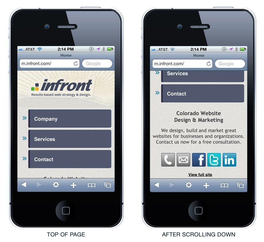
Think of a mobile users as “on the go,” and you’ve got the right idea. Their attention span is very short, they’re looking for some quick info and then leaving. Take a look at our mobile site to see what I mean:

Simple, right? There are only three main tabs as soon as you land on the page: Company, Services, and Contact. If you scroll down further, you’ll find links to contact us via phone and email, as well as links to connect with us on Facebook, Twitter and LinkedIn.
The beauty of these links is that on most mobile phones, simply pressing on the “phone” icon makes the phone start to dial the number, and pressing the “email” icon creates a new email with the address embedded, all ready to go. It’s fast and handy. If the user doesn’t want to start an email, he can also use the contact form under the “contact” tab instead.
Give users the option to view the full website. This is an important feature. At the very bottom of our mobile site is a link that says “view full site.” This is crucial because there may be times when a website visitor wants to see the full site on his or mobile device, especially if he or she is already familiar with your company and wants more than just your contact info. So give them the option to go from the mobile site to the main site. (Note: this does not apply to the converse—you don’t want to put a mobile link on your main website. Desktop viewers will never want to see your mobile website.)
Set user-agent detection to automatically route mobile traffic to the mobile site. The way that you actually show the mobile site to mobile users is by modifying the server settings to auto-detect if a user is coming from a mobile browser.This is really easy to do if you know how to modify an htaccess file (if it’s hosted in a linux server). What then happens behind the scenes is your smartphone’s browser tells the server its “user agent” (which is a long string of information identifying what kind of device it is and which browser it’s using) and the server can serve up the proper version for that particular browser. Regardless of whether a visitor is using an iPhone, Android, Blackberry, or any other mobile device, just send them all to m.yourdomain(dot)com. Some websites in the past had separate mobile websites for different mobile devices (for example, Merriam-Webster had an iPhone-specific online dictionary at i.m-w(dot)com, but this is also an outdated practice now that companies just build iPhone Apps for this purpose. Just about all smartphones these days have full-blown browsers and are “smart” enough to render the same website.
So keep it simple, point all mobile traffic to the “light” mobile version of your website and next time you can see exactly what kind of info people are looking for when they’re using a mobile browser. Stay tuned!

Matthew is the President of Infront Webworks and is a New England native now calling Colorado Springs home. Matt attended The University of NH where he pursued a BS in Natural Resource Economics & Business Administration. Aside from Infront; Matthew has owned and managed two other online agencies based on the seacoast of New Hampshire and been a key player in multiple technology mergers & acquisitions. When he’s not bathing in technology, online marketing & business; he’s probably spending time with his wife and daughter, boating, skiing the trees, hiking or cooking..he is a foodie for sure!


