Getting lots of online traffic is great – but it’s only half the battle. Learning how to increase your landing page conversion rate is essential.
What really matters is the percentage of visitors you can convince to become customers.
The most powerful conversion tool in your online arsenal is your landing page. Its sole function is to persuade visitors to take action – through buying, signing up, or downloading – that brings them one step closer to becoming customers.
The users who arrive on your landing page are there because they’ve clicked on a related link – so you know they’re interested.
Here’s how to leverage their interest to bend that conversion rate curve.
Know Your Target Audience
Identify your audience demographic, and know their needs, concerns, and preferred terminology. Your content should explain to prospective customers exactly how your product or service will address their needs.
Style and content should be tailored specifically for your target demographic.
If you haven’t identified a specific demographic, advertising first to a general audience. Then, assess conversion rates for each demographic. Identify the “converters”, and target them comprehensively in the next stage of your marketing plan.
Make Friends with Facebook
Since the goal is sales, you want customers – not merely visitors – to arrive on your landing page.
So establishing a Facebook presence is a smart move.
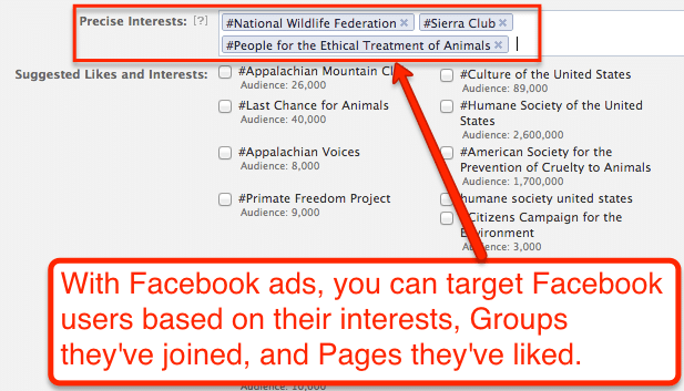
With about 1.66 billion daily average users, Facebook offers a huge ready-made market. When you make your pitch on their advertising platform, you’re getting access to a wide range of clearly-defined audiences.
You can tailor your ads based on a number of variables – like age, gender, interests, and education – and avoid the hit-or-miss conundrum.
Facebook lets you drill down to see exactly who you’re getting through to. And if you consistently provide useful, engaging content (which of course includes links to your landing page), users will be inclined to do business with you.
Cultivate Good Copy
Several things can go wrong with your copy, from poor design to poor messaging.
Check your message layout.
Display important features – the stuff you want users to see before taking action – above the fold. That includes an attention-grabbing headline, a value proposition, appealing imagery, and clear CTA’s.
By prioritizing your message elements, you’ll convey your main message quickly, and users can decide if they want to continue scrolling to learn more about your business.
The way users perceive a page can determine whether they’ll stay or leave. For example, if they have difficulty reading your offer, they’re not inclined to invest time with you.
Make it easy for them
- Use a font that’s easy to read (at least 16px), and use it consistently throughout the page
- Break the text down into paragraphs by sticking to the one-idea-per-paragraph rule
- Use additional space between paragraphs to ensure the text blocks don’t overlap
- Utilize bullet points to set out key information
- Use clear, concise language
Buying decisions can be a complex brew of logic and emotion. Ideally, your messaging will appeal to both.
Before creating your landing page, define the emotional wants and practical needs that your product or service fulfills.
Then make sure that message comes through loud and clear on your landing page.
Ensure a Good Page Experience
Visitors spend just 3 to 20 seconds on a webpage before they bounce.
But if your page is easy and pleasant to use, they’re more inclined to linger – and you’re more likely to turn prospects into customers.
Provide content that’s useful, relevant, and original
- Ensure your landing page relates directly to the ad text and keywords.
- Offer useful, specific information about what you’re marketing.
- Provide content or features that are unique to your page.
Build Trust through Transparency
- Provide clear information about your business.
- Explain products and services before requesting action.
- Make contact info easy to find.
- Explain requests for personal information.
Make Navigation Easy
- Don’t make visitors hunt for information.
- Make the ordering process quick and simple.
- Eliminate annoying pop-ups.
- Prioritize information from top to bottom.
Minimize Loading Time
- Ensure your landing page loads quickly when users click on your ad.
- Google rates a good loading speed as 2 – 3 seconds.
- Over 3 seconds, 40% of your visitors will bounce.
Steer Clear of Bells and Whistles…
- Eliminate unnecessary visuals.
- A simple, clean design is far more effective for encouraging user interaction.
But Give Them Something to Look At
- Humans process visual information thousands of times faster than text, so make the page visually attractive
- Adding video content can increase conversion rates by over 80%
- Personalize your content so that relate to it better
Make It Mobile Friendly
- Over 60% of your visitors are viewing your landing page on a mobile device – so ensure your landing page has a responsive design that automatically changes format
The landing page experience takes up a good chunk of Google’s quality score algorithm. So making tweaks now can produce a higher ranking later.
Providing your guests with a positive experience isn’t just good manners. It’s good business.
Practice the ABCs of A/B Testing
You can’t know what produces optimal user response unless you test different versions of your marketing tools.
A/B testing will give you empirical evidence by measuring user response based on click-through rates (CTR).
You should begin with a clear idea of how effectively your landing page is performing, and set a realistic goal for improvement.
Keep it simple. Focus on one element at a time, and ensure that your test design will measure that specific element.
For example, if you’re getting traffic but not seeing the hoped-for conversion rate, the problem may not be the body copy: it may be the button size or color. If you try to overhaul everything at once, you won’t be able to determine the real source of the problem.
You can use this method to test just about anything on your landing page:
- Headline
- Visuals and graphic
- Body copy
- Special offers
It allows you to compare the performance of an original version (A) to a slightly altered version (B). The results pinpoint exactly which features are working effectively, and which aren’t.
This takes the guesswork out of your optimization efforts, and it’ll ensure you’re putting out the most effective content possible.
That could mean a big boost to your bottom line.
Just as technology and consumer behavior continue to evolve, so should your marketing tools.
Make A/B testing a regular practice.
Fix Your Leaky Funnel to increase your landing page conversion rate
To create an efficient funnel from your traffic source (whether it’s Google search, ads, or emails) to your landing page, you need a tight fit.
Your landing page content needs to match the messaging of your ads. Otherwise, it won’t convert well.
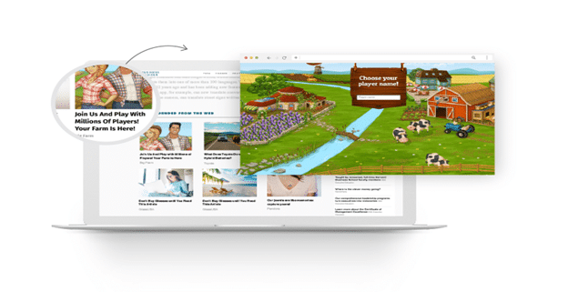
For example, if your visitor is coming from a Google search, your landing page should employ the same keywords that they used while searching. If you’re using cold email outreach to promote your business, then your landing page must address exactly the same problem you promise to solve in your email message.
There should be similar themes, styles, and imagery when moving from the source to the landing page.
Matching really does matter.
If visitors feel they’ve been sent to a page that has little or nothing to do with the ad they’ve clicked on, they’ll bounce.
Clearly Convey Value
The best content in the world won’t hit home with your visitors without a clear value proposition.
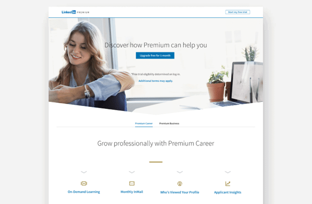
What are you offering them?
Any calls to action will be meaningless if your prospects can’t see what’s in it for them. When they view a CTA, they need to be able to see immediately what they can gain by clicking (and what they’ll miss out on if they don’t).
Instead of focusing on what the user must do, concentrate on creating copy that lays out the benefits of your offer.
What aspirations does it fulfill? What pain points does it relieve?
The pro’s of clicking should far outweigh the cons – so give them the right incentive.
Clarify Your Call to Action to improve your landing page conversion rate

Your landing page invites visitors to perform a simple action, such as starting a free trial or accepting a special offer.
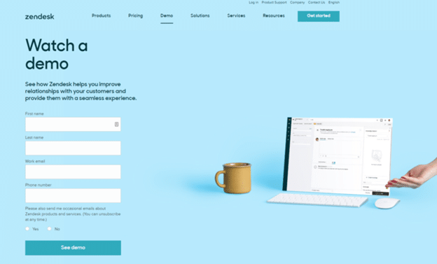
Your CTA button should be clear, prominently placed, and easy to respond to.
Use simple, active language like “Sign Me Up”, or “Start My Free Trial” to inspire user response.
Your landing page should present a single request for action. Years of psychological research confirm the “paradox of choice” theory: the more choices people are offered, the less likely they are to act.
Convinced of the power potential of your landing page?
Think of it as your digital calling card. It’s your chance to make a first impression – and you want that first impression to be a good one.
Do the math.
A clear, well-designed page that offers your target audience valuable benefits + a simple call to action = a good customer experience.
And by giving visitors a positive experience at the beginning of their journey, you give them a good reason to stay with you and make the transition from prospect to customer.
Improve your Landing Page Conversion Rate

Matthew is the President of Infront Webworks and is a New England native now calling Colorado Springs home. Matt attended The University of NH where he pursued a BS in Natural Resource Economics & Business Administration. Aside from Infront; Matthew has owned and managed two other online agencies based on the seacoast of New Hampshire and been a key player in multiple technology mergers & acquisitions. When he’s not bathing in technology, online marketing & business; he’s probably spending time with his wife and daughter, boating, skiing the trees, hiking or cooking..he is a foodie for sure!

