- Home
- Digital Marketing
-
-
Digital Marketing
-
-
-
-
-
Need A Website or Seo Help?
-
-
-
- Websites
-
-
Websites
-
-
-
-
Need A Website or Seo Help?
-
-
-
- About
-
-
About
-
-
-
-
Need A Website or Seo Help?
-
-
-
- Case Studies
-
-
Case Studies
-
-
-
-
Need A Website or Seo Help?
-
-
-
- Blog
- Contact
Home > The Nature Place
The Nature Place
Bringing People Together Through Nature
Industry: Medium Business
Project Info
The Nature Place was founded as Sanborn Western Camps in 1948 in Florissant, Colorado. The goal was for young people to have a place in nature where they could learn to live together and experience the joy nature. This is a goal they have carried since, changing their name to The Nature Place in 1978 so adults could experience the outdoors as well. Since then, 3,000 guests attend the leadership and team development programs, natural history lessons, and participate in reunions annually.
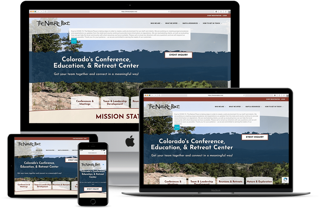
While The Nature Place was enjoying sharing their love of nature and teaching folks young and old about living together and experiencing nature, their website was starting to fall behind in the modern age of technology. The website was not optimally viewable on mobile devices. The backend was becoming increasingly unusable, making updates to content and SEO harder to accomplish.
scroll me
Challenges
- The website was in a legacy platform that was hard to manage, making it important that the platform they went into was easier to use.
- While the market isn’t competitive, the design needed to be modernized to attract customers.
- There was no responsiveness, making the website hard to view on tablets and phones and increasing the bounce rate of visitors on both devices.
- The mega menu made it hard to navigate the website, making it tough to go deeper into the website and causing viewers to leave the website instead of exploring.
- The website had event registration and member information that needed to be transferred, as well as all the data for previous and upcoming events.
Solutions
- WordPress was chosen to host the new website, allowing faster load speeds and an making it easier for the team at The Nature Place to make updates to their website.
- The design was updated with a responsive theme to support desktop, laptop, tablet, and mobile viewing.
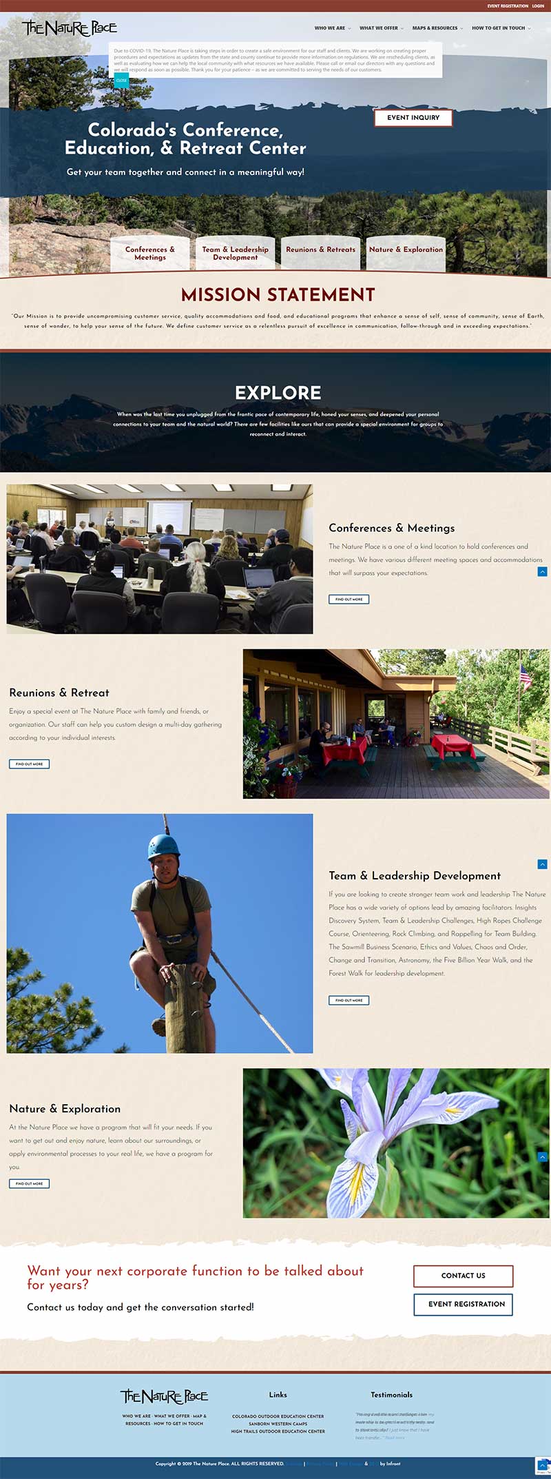
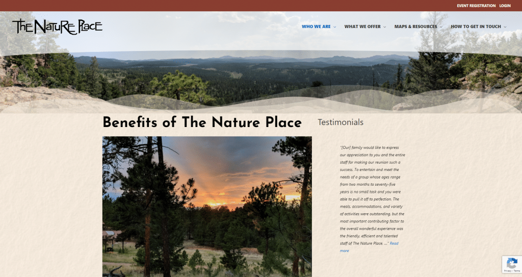
- The colors of the website were changed from blues and grays to inviting browns and blues reminiscent of Colorado.
- The navigation was set up without the mega menu, making it easier to find information on events, the location, and contacting the team.
- The most popular events, Conferences, Team and Leadership Development, Reunions, Retreats, and Nature Exploration were placed above the fold in a location that draws the viewer’s eye, driving the viewer deeper into the website.
- The forms for events are handled outside of WordPress, with the forms placed in iframes on the website.
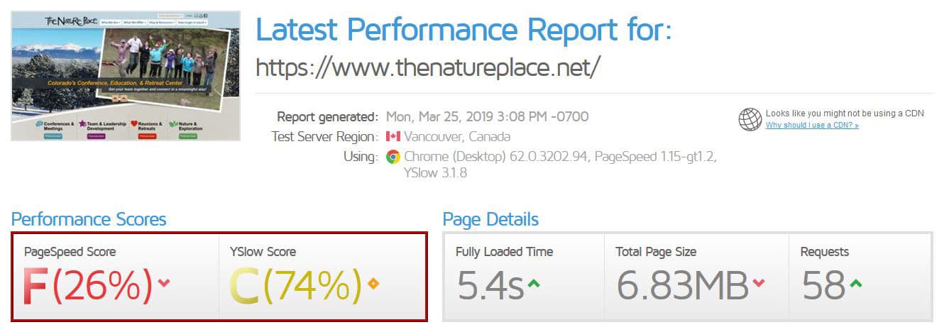
- The website’s performance score increased by over 80%, providing visitors with an overall better user experience as they look through the website.
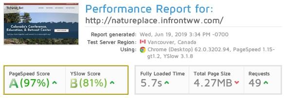
The Result
The Nature Place now has an optimized website that is not only mobile responsive and more modern, but now provides a much friendlier user experience. With WordPress, employees will be able to make edits to their website in an easier and faster manner, and they continue to have access to all the previous information they need for events. Members can log into the new website and continue to access their information from the old site, giving front-end users ease of use.
