Guest Author: David Mitchell
When someone visits your website, they form an opinion in just a few seconds. It’s not always about what you say; it’s about what they see. A clean layout, easy-to-read text, and strong visuals help people feel comfortable right away. If your site looks messy or confusing, visitors might leave before reading a single word.
Design is like a handshake; a good one builds trust. That’s why elements like balance, spacing, and font choice matter. People often trust sites that look professional, even if they’re not familiar with the brand. That trust is what encourages people to stay and click.
User Behavior
Good web design isn’t just about making something look nice. It’s about understanding how people behave. Most users don’t read every word on your site; they scan. They look for headings, buttons, and images to guide them. That means your layout needs to guide them too. Put the most important stuff at the top. Make buttons easy to see. And don’t crowd the page. Too much information at once can overwhelm visitors. Think of your site like a well-organized store layout, you want people to walk in, feel welcome, and know where to go next.
Trust and Emotion
People don’t make choices based on logic alone. Emotions play a big part. If your site makes someone feel safe, curious, or excited, they’re more likely to take action, whether that’s signing up, making a purchase, or reading more.
Use pictures that show real people or situations your audience can relate to. Be honest in your wording. Add trust signals like customer reviews or secure checkout badges. These small touches tell people, “You can trust us.”
Color and Action
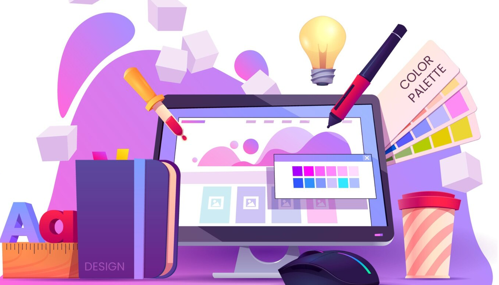
Colors are more than decoration. They send messages. Red grabs attention. Blue builds trust. Green can signal success. Pick a color scheme that matches your message and audience. Don’t use too many colors at once or it can feel confusing.
Want to know why McDonald’s uses red and yellow? Or why banks often choose blue? It’s all tied to psychology. Colors influence how people feel.
Interesting Fact:
Studies show that people decide whether they like a website in just 50 milliseconds, and color plays a huge part. If you’re curious about this, check out our guide on website color theory and how it can affect user decisions.
Clear Calls to Action
If someone lands on your site, what do you want them to do next? That’s your call to action (CTA). Maybe you want them to sign up, book a demo, or buy something. Make that CTA clear and easy to find.
Use words that guide, like “Start now,” “See plans,” or “Try free.” Place buttons where people naturally look, like right after a product description or at the bottom of a blog post. Don’t make them scroll forever to take the next step.
Even better, test different versions to see what works. A small change in button color or wording can mean a big boost in clicks.
Layout Matters
A good layout means everything has its place. Headings should be bold and clear. Text should be easy to scan. Images should support the content, not distract from it. Use space to give your content room to breathe.
A crowded page can feel like a noisy room, it’s hard to focus. But a well-designed page makes people feel like they’re in control. They can scroll at their own pace and find what they’re looking for.
What High-Converting iGaming Sites Get Right
If you want a real-world example of sites that rely heavily on smart design to boost engagement, look no further than the affiliate niche, specifically the online casino space. These sites are built to keep users engaged, guide them toward action, and earn trust within seconds.
In the competitive iGaming niche, simple navigation and clear calls to action are essential. Players want fast access to games, bonuses, and reviews without confusion. We’ve seen how the right color choices and layout help users feel confident enough to explore and convert.
Whether you're selling software, helping bonus-hunters, or offering vacation packages, the core principle is the same: design with the user in mind and remove friction wherever you can.
Final Thoughts
Design isn’t just decoration; it’s how your website communicates. A smart layout, the right colors, and clear calls to action can make people feel welcome, understood, and ready to act. So next time you’re building a site, think like your visitor. What do they need? What do they feel? When you design with those answers in mind, your site won’t just look good; it’ll work.
David Mitchell is one of the founders of the affiliate website nodeposit.org, a site that has served online gamblers since 2003 with trusted reviews, expert tips, and news from the iGaming world.