Mobile-first and responsive web design

Design for the phone first. Everything else follows.

Most of your visitors arrive on a phone, and Google indexes the mobile version of your site first. Responsive design is the minimum. Mobile-first design goes further: it starts with what the person holding the phone needs, then scales up to tablets and desktops, so the site is fast, readable and easy to use with a thumb.

  • 9 in 10US adults own a smartphone (Pew Research)
  • 15%Of US adults are online by smartphone only
  • Mobile firstHow Google indexes and ranks every site
  • 3 secondsBefore most mobile visitors give up on a slow page
Why mobile first

Mobile responsiveness is not enough to keep visitors on your site

If you want a website that potential clients and Google both love, choose mobile-first design.

Your customers are on a phone

Roughly nine in ten American adults own a smartphone and about one in seven go online only through it. For most business sites, more than half of visits are mobile. A site that is awkward on a phone is awkward for the majority.
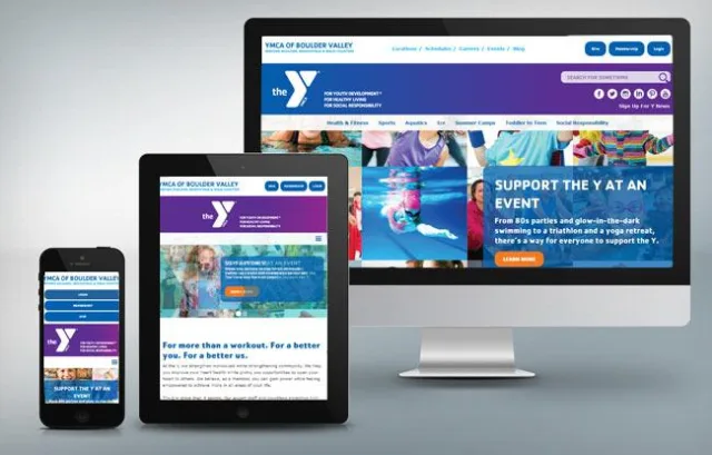
Google looks at the mobile site first

Mobile-first indexing means Google crawls and ranks the mobile version of your pages. If the mobile version hides content, loads slowly or is hard to use, rankings on desktop suffer too.

Speed is part of the design

Mobile-first design treats speed as a feature. Fewer, lighter assets, images sized for the screen and layouts that do not shift are the difference between a visitor who stays and one who leaves within three seconds.

Responsive design vs. separate mobile sites

One site that works everywhere, or two that drift apart

Separate mobile sites were the old school of thought. Responsive, mobile-first design replaced them for good reasons.

Responsive, mobile firstSeparate mobile site
Content changesMade once, shown everywhereMade twice, often drift apart
MaintenanceOne website, no separate appTwo sites or an app to maintain
ContentVisitors see the full site on any deviceMobile visitors often get a cut-down version
SearchOne URL per page, one set of rankingsDuplicate URLs, split signals, redirects
InvestmentHigher up front, better long-term ROILower up front, costlier over time
StatusCurrent best practice, mobile-first indexing readyLegacy approach from before modern CSS and frameworks
How we design mobile first

Six principles in every design

Frame the content for the phone

Responsive design is not just scaling visual elements. It is how you frame content, emphasize the information that matters most and reduce the effort of navigating by touch.

Thumb-sized targets

Buttons, links and form fields big enough to tap, spaced so the wrong one is hard to hit, and the important actions within thumb reach.

Readable without zooming

Type sizes, line lengths and contrast chosen for a small screen in daylight, with the main message visible before any scrolling.

Fast by default

Images served at the right size and format, no render-blocking scripts, and layouts that do not jump as they load.

Call, directions, book

Click-to-call, map links and short forms where mobile visitors expect them. Mobile intent is often "now."

Then scale up

Tablets and desktops get more room, more columns and richer imagery, built from the same code and the same content.

Responsive work

Designed for the phone, the tablet and the desktop

Every site in our portfolio is responsive. These show the same site on three screens.

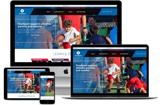
TrueSport (USADA) website on desktop, tablet and phone
EducationWordPress

TrueSport (USADA)

Three separate websites consolidated into one modern, fast site with a working store and pages the team can edit themselves.

View the case study
Performance Tours website on desktop, tablet and phone
TourismWordPress + WooCommerce

Performance Tours

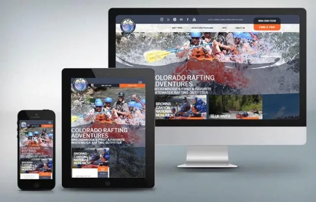
Colorado rafting outfitter with online trip booking, trip pages built to rank, and photography that sells the experience.

View the case study
Denver Police Museum website on desktop, tablet and phone
Non-profitWordPress + WooCommerce

Denver Police Museum

Museum site with events, programs, membership and an online store, designed for visitors on every device.

View the case study
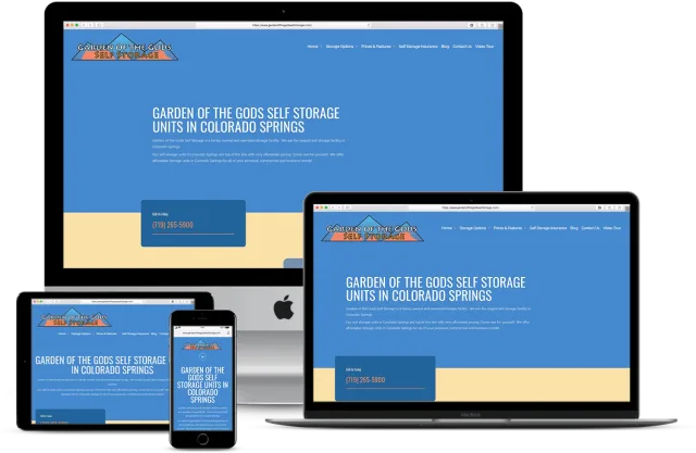
Garden of the Gods Self Storage website on desktop, tablet and phone
Self storageWordPress

Garden of the Gods Self Storage

A dated, fragile site replaced with a clean design and a stable back end. Organic traffic later grew more than 1,000% with SEO.

View the case study
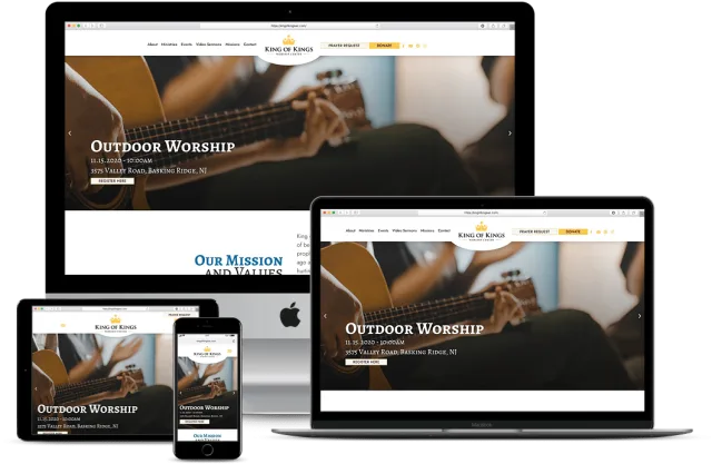
King of Kings Church website on desktop, tablet and phone
ChurchWordPress

King of Kings Church

Out-of-date content and broken links replaced with an engaging design, rewritten pages and a streamlined editor for staff.

View the case study
Mobile design questions

Frequently asked questions

01What is the difference between responsive and mobile-first design?

Responsive design makes one website adapt to different screen sizes. Mobile-first design is a strategy that uses responsive frameworks but considers the mobile user's needs first: content, speed and touch before desktop layout. Instead of building a desktop site and squeezing it onto a phone, you design for the phone and expand.

02Do I still need a separate mobile site or an app?

Almost never. Separate mobile sites on a sub-domain were common before modern HTML, CSS and frameworks made responsive design practical. Today they create duplicate content, split search signals and double the maintenance. A responsive, mobile-first site covers every device from one codebase.

03What is mobile-first indexing?

Google uses the mobile version of your pages for crawling, indexing and ranking. If content exists only on the desktop version, Google may not see it. Your mobile site needs the same content, structured data and metadata as desktop.

04How fast does a mobile page need to be?

Google's Core Web Vitals set the bar: largest content visible within 2.5 seconds, interaction responses under 200 milliseconds and almost no layout shift. Google's own research found more than half of mobile visitors leave a page that takes over three seconds. You can check your site with Google's PageSpeed Insights.

05Can you make my existing site mobile friendly?

Sometimes. If the site is on a modern platform with a sound structure, a responsive theme and speed work can get it there. If it was built desktop-first on an old framework, a rebuild is usually cheaper and better. A free evaluation tells you which.

06Does mobile design affect conversions?

Strongly. Mobile visitors convert less on most sites, and the gap is almost always the design: slow pages, tiny buttons, long forms, hidden phone numbers. Mobile conversion rate optimization is our most requested CRO service for that reason.

Free quote

Make your site work for the people on their phones.

Send us your website address. We will check it on real devices, tell you what mobile visitors experience and quote the fix or the rebuild.

  • Free, no-obligation quote within one business day
  • Straight answers from the people who will do the work
  • Or call sales now: (719) 577-4404

Get a mobile-first design quote

Fields marked * are required.

All submissions are private and confidential. See our privacy policy.

Get a free website & SEO audit

Tell us your web address and we will send a plain-English review of what is holding your site back. No cost, no obligation.

Call (719) 577-4404 Get a Free Quote